Menus are one of the most vital parts of every website. They are omnipresent and they guide users through your blog. And while it’s relatively easy to add a navigation menu in WordPress, there’s so much more you can do in order to customize it for your website.
Whether it’s a small icon you want to have on the menu or you want a completely different system to handle it, this guide has it all. Check out tips, tricks and some of the best menu plugins that we prepared for you in this guide:
Creating a menu in WordPress was never easier. All you have to do is generate pages and add them next to your homepage. Your main navigation menu will be done with just a few clicks but it will probably look very plain.
There are numerous plugins that can help you in creating a visually stunning navigation menu. You can, of course, code yourself one if you know how to, but there is a simpler way to make your regular menu more user-friendly – by adding icons.
Icons have become something we can’t live without. When you search for something in your WordPress dashboard, on your desktop, or on your smartphone and tablet, you are probably used to using icons. After only a few times of using a new application, you are more likely to remember its icon than all the description text which comes with it. So, why wouldn’t you put an icon next to your menu item and let people navigate through your site with ease?
Menu Icons
PRICE: Free
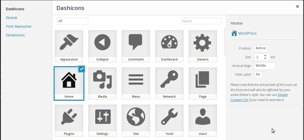
If you don’t know how to do that, don’t worry, that’s why you’re here. In this part of the guide, we’re not going to bother you with custom coding, but we’ll simply show you a neat free plugin which you can configure in the next few minutes.
- Go to Plugins->Add New
- Search for “Menu Icons”
- Install and activate the plugin
- Navigate to Appearance -> Menus
- Open your navigational menu
- Select a page under menu structure for which you want to select an icon
- Choose the icon, edit its position and size
- Save menu
That’s it! Now go find some cool icons you want on your menu and enjoy your new design. While you’re still working with icons, don’t forget that you can easily add a favicon to your WordPress blog as well.
Add login/logout button to the menu
One of many WordPress’ features that we love is its easy way of registering new users. Controlling different user roles on the popular platform couldn’t be easier; there are already registered roles which you can assign and you can even create numerous custom user roles for the need of your site.
While registering them is fast and easy, taking care of your users can be a hard work. But you need to make everything in your power to make their experience on the website as good as possible.
One of many things you could do for them is to enable an easy way of logging in and logging out from your site. To make login/logout links always in reach of users’ hands, you can put those links right to your main menu. First thing, having those links in the menu are very practical and secondly, your users have probably grown accustomed to the feature from various other applications that use the same way of logging in and out.
In this case, there’s no need in grabbing another plugin. A simple WordPress function which we’re going to show you in this part of the article can do a great job for you. It will automatically place the correct link on your menu. That means that while a user is logged out, he will get the “log in” link and vice versa. Neither you nor the user will have to worry about login buttons again.
If you’re ready to add this simple yet neat login feature to the menu, here’s what you’ll have to do:
- Open functions.php
- Copy and paste the following:
function add_login_logout_link($items, $args) {
$loginoutlink = wp_loginout('index.php', false);
$items .= '<li>'. $loginoutlink .'</li>';
return $items;
}
add_filter('wp_nav_menu_items',
'add_login_logout_link', 10, 2);
- Save changes
As with most of our snippets, you’re done simply by copying and pasting the function into the file. Once you’re done, you can go on and reload the homepage. Since you’re still logged in, you will get the “log out” link on the last spot of your main menu. Be sure to check out the entire function so try logging out and back in to assure yourself everything’s ok.
Now that you’re done with this little feature, don’t forget that you can easily redirect users to another page after a successful login or even show content only to logged in or logged out users.
Also, now that you have a customized menu, you might be interested in showing it anywhere on the site by providing a custom shortcode.
We love customizing WordPress with little snippets like this one, how about you?
Display WordPress menus anywhere you want
After WordPress reached version 3.0 many things became easier to use. Among different new features, creating a navigational menu became accessible to anyone and today everyone can build their own menus with a few simple clicks of a mouse button.
While creating menus where you can easily link any post, page, category or any external link is a piece of cake, showing the menu on different places along your site can be a little bit bigger bite for those who aren’t into WordPress development.
Depending on the WordPress theme you’re using, you can easily display a newly created menu on top of your page where we’re all used to find navigation. You may have the option to place your menu on the sidebar or even right down in the footer area, but what if you wanted to show the menu in your posts, pages, or even in the widget?
No, you don’t have to create custom lists or retype the entire HTML code in order to replicate the links; you can take the advantage of shortcodes and place an existing menu anywhere you want!
In the following lines, we’re about to show you how to do that and we’re sure that you’re going to like your new ‘menu in the shortcode’ feature.
Create a shortcode and display WordPress menus anywhere you want
- Open functions.php file
- Copy and paste the code which will register the shortcode:
function menu_function($atts, $content = null) {
extract(
shortcode_atts(
array( 'name' => null, ),
$atts
)
);
return wp_nav_menu(
array(
'menu' => $name,
'echo' => false
)
);
}
add_shortcode('menu', 'menu_function');
- Save changes
Right after you save the changes, you will be able to display WordPress menus anywhere you want. All you have to do is to write down the shortcode where you have to specify the name of the menu you’re going to use:
[menu name=”main-menu”]
In most cases, your main menu will have the “main-menu” name attached to itself. But if you’re going to use any other menu, simply enter its name in the shortcode. You don’t have to know every menu name by heart; instead, navigate to Appearance -> Menus and browse through the list of menus or create new ones.
Since you’re now able to display WordPress menus practically anywhere, you can create numerous navigations that you’re going to use on your WordPress powered website. You can have one in a post, another one in template files, a Text Widget, etc.
Unless you have removed the feature, WordPress allows your visitors to search through your entire site. We have mentioned this cool feature several times and showed you different things you could do with your search pages. For example, you could easily redirect users to the post if there’s only one result found or even set up a custom Google search.
If you have browsed through your standard WP widgets, you have probably seen that there is a search widget ready to be placed on a sidebar. But what if you want your search box to appear next to your menu instead?
In the following lines, we will show you a function which will take your everyday search box and put it in the navigation menu.
Add a search box to the menu:
- Open functions.php
- Copy and paste the following:
add_filter( 'wp_nav_menu_items','add_search_box',
10, 2 );
function add_search_box( $items, $args ) {
$items .= '<li>' . get_search_form( false ) .
'</li>';
return $items;
}
- Save changes
To be sure that the code will work for you, make sure that you have a navigation menu already added to your site.
The code is pretty simple and its only function is to add the search box to your nav menu. Most probably, your search box won’t be aligned where you wanted it to be. That means you will have to tell WordPress where to put the search box:
- Add a class to <li> tag found on the third line of code:
$items .= '<li class=”searchbox-position”>' .
get_search_form( false ) . '</li>'
- Save changes
- Open style.css
- Copy and paste the CSS code:
.searchbox-position {
margin-top: 15px;
margin-right: 20px;
}
- Change the code to your liking
- Save changes
Hopefully, you have nested the box just perfectly next to your menu. It doesn’t take much to fit the box where you want it. Don’t forget to style the search box itself and enjoy the feature.
If you want more control over your menu and search box, check out how to add icons to your menu and how to add a voice search option for visitors who like to dictate their search terms. There is much more you can do both with your menu and your search options so test our search box and learn something new.
You have probably seen websites where navigation menus stick on top of the page and follow you every step on your scrolling adventure. That feature might be something you want on your WordPress website and in this part of the guide, we’re about to show you how to create one.
Not only it has a functional side where the menu is always available within the reach of your hand, but it can also look very beautiful and fluid.
If you have a bit of CSS knowledge, you won’t be having problems with making your menu sticky. You only have to add a piece of code to your Style.css file after which you can enjoy your new menu feature.
- Open your Stylesheet (style.php)
- Find .nav-menu or .genesis-nav-menu (or similar, depending on the theme you are using)
- Use the following code for your main menu container:
.nav-menu {
position:fixed;
background: #333;
top: 0px;
right: 0px;
left: 0px;
z-index:99;
}
As you can guess from the code, the important part comes at the second line where you need to fix the position of your menu. After that, you can set the the top, right and left elements to 0 pixels or move them to any distance from the top or from the left and right margin of the page (for example: top: 10px will place your menu 10 pixels from the top margin of your site).
- Update your file and enjoy your sticky navigation menu
If you don’t like messing with the code, you can use plugins to make your menus sticky.
We taught you how to create a sticky navigation menu simply by changing a line of CSS code in your theme. But, no matter how easy this might be, not everyone likes to go through WordPress files and edit the code themselves. If you’re that type of person or you need more control over the menu, don’t worry. You can easily set up your menu and make it sticky by using plugins. In this part of the article, we’re going to show you some of the best.
UberMenu Sticky Extension
PRICE: $8
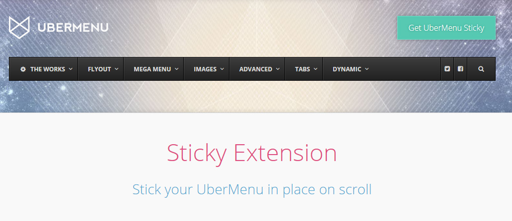
UberMenu Sticky Extension is an add-on for UberMenu plugin which means you have to install this plugin first to make the extension work. The extension makes everything simple; after the installation, you’re ready to make your menu sticky. No matter where you place your menu, once a user starts scrolling, the menu will stick on top of the page and make it easily accessible.
To make sure mobile users can access every part of the menu, the sticky option goes off once a mobile device is detected. There is no much to add here – check out the demo on the official site and if you already have UberMenu, go ahead and make your menu sticky.
myStickymenu
PRICE: Free – DEMO
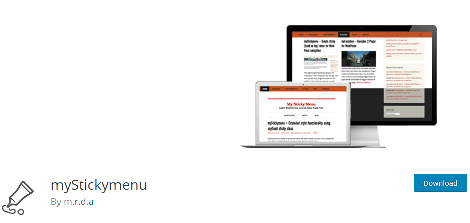
This plugin is designed to be used on Twenty Thirteen theme. But if you tweak it a bit, you may use it on any theme you like. By default, it uses the theme’s navigation CSS class “.navbar”. So if you want to use it on some other theme, you have to find the class which your theme uses to describe the navigation menu and change the name of that class.
If your theme is responsive, the plugin will also be responsive. If you want to modify it more, you are welcome to enter your custom CSS styles and make your sticky menu even more personalized.
Sticky Menu (or Anything!) on Scroll
PRICE: Free
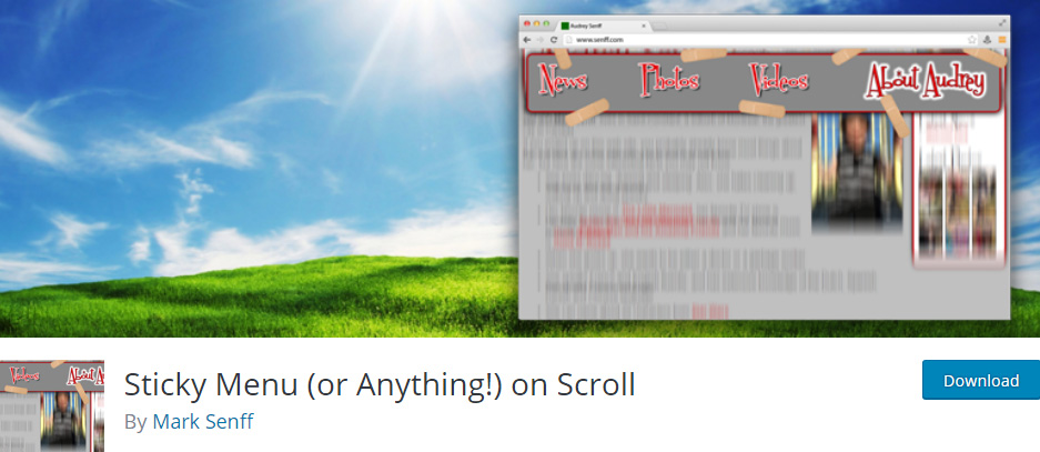
This plugin will allow you to place your menu on top and make it sticky. But not only that, the plugin will allow you to make any element sticky just by finding the right selector for the element. That means you can make your logo or even the entire header stuck on the top of the page while users scroll through your website. To make everything work, you will have to know a little bit about HTML and CSS so you can find the right selector.
How to remove top-level menu items in WordPress
You probably already know that WordPress is highly customizable. If you know how to code or at least find the right plugins, you can transform your backend as well as the frontend and showcase a unique website to your visitors and your authors as well.
In this part, we will show you a simple code that will allow you to remove top-level menu items from your WordPress admin pages.
The code you can find below will remove all top-level menu items to all users instead of admins. Before you continue, you should know that this snippet only removes the menu items but that those items will still be available to anyone who knows the correct path to a settings page. If you want to completely restrict access to certain menu pages, you will have to change the user capabilities.
Remove top-level menu items:
- Open your functions.php file
- Copy and paste the following code:
if (!current_user_can( 'manage_options' )) {
add_action( 'admin_menu', 'my_remove_menus', 999 );
}
function my_remove_menus() {
remove_menu_page( 'index.php' ); //Dashboard
remove_menu_page( 'edit.php' );      //Posts
remove_menu_page( 'upload.php' );    //Media
remove_menu_page( 'edit.php?post_type=page' ); //Pages
remove_menu_page( 'edit-comments.php' ); //Comments
remove_menu_page( 'themes.php' ); //Appearance
remove_menu_page( 'plugins.php' ); //Plugins
remove_menu_page( 'users.php' ); //Users
remove_menu_page( 'tools.php' ); //Tools
remove_menu_page( 'options-general.php' ); //Settings
}
- Save changes
As this code removes all of the top-level menus which you probably don’t want to do, feel free to modify the code to your needs. Each “remove_menu_page” line is in charge of removing one page (which is described in the brackets as well as in the comment beside the line of code). Simply add or remove a page you want to be absent from your menu and save changes one more time.
Now that you have learned how to remove top-level pages from the menu, you might want to remove only some of the subpages which are located under the top-level ones.
Once you have started building your new website, sooner or later you’re gonna need a menu. You can create one using a standard menu option in WordPress but if you want a more professional one, you will have to know your HTML and CSS codes. That also means you will spend some time designing everything to work perfectly and to look beautiful at the same time.
But if you need a quicker solution or you simply don’t know how to code your own fancy menu, WordPress allows you to install some great plugins which are designed to make gorgeous menus in a matter of a few clicks. Without any particular order, here are some of the best menu plugins for WordPress.
Uber Menu
PRICE: $20 – DEMO
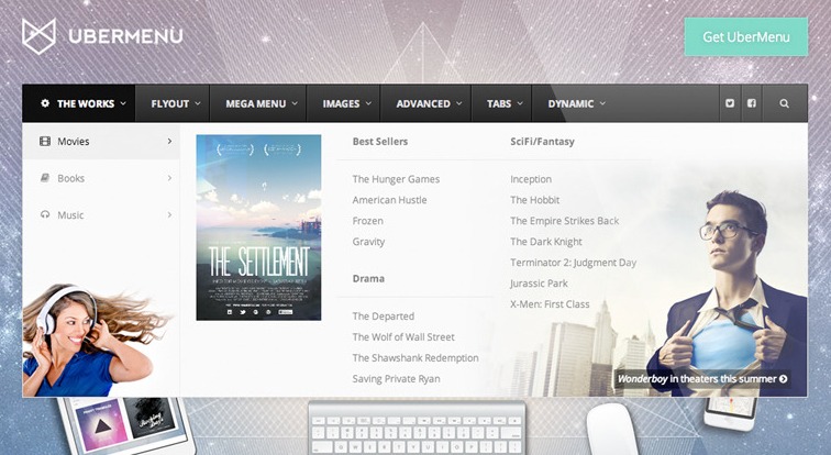
With over 43,000 sales, Uber Menu is one of the most popular plugins for WordPress. Once you open the demo site and see what does the menu created with this plugin look like, you will understand why it’s so popular. And once you start listing its features, you’ll probably want one for yourself.
Menus created with the Uber menu will be responsive and touch-enabled for your mobile visitors. You can create beautiful layouts and place icons, images, videos and maps into your menu. The entire form could be placed into a submenu so you can create a contact form without having to add an extra page for that. The plugin is highly customizable and you can play around with over 50 style settings with live preview. You can build submenus automatically from your other content, create tabs under your menu and much, much more.
- Dynamic item generation
- Tabbed submenus
- Enhanced user interface
Morph: Customizable Fly-Out WordPress Menu
PRICE: $20 – DEMO
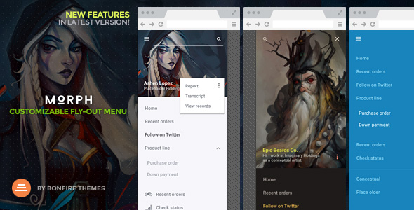
Morph is a fly-out menu designed for mobile devices. But, as you can see on the demo page if you open it on your personal computer, it looks really great on the desktop, too.
By using this plugin, you can hide a menu and call it out with a simple click. On the menu area, you can create a standard drop-down menu, add pictures, search buttons, and the whole area is widgetized which means you can embed anything you need and want. The plugin is very customizable so you can choose colors you want, change image heights and add or remove elements to suit your needs. If you are going to use it for mobile devices, you can easily set resolutions for which the menu will appear.
- Works great both on desktop and mobile devices
- Add/remove customizable elements
- Can be triggered by any element
Hero Menu
PRICE: $19 – DEMO
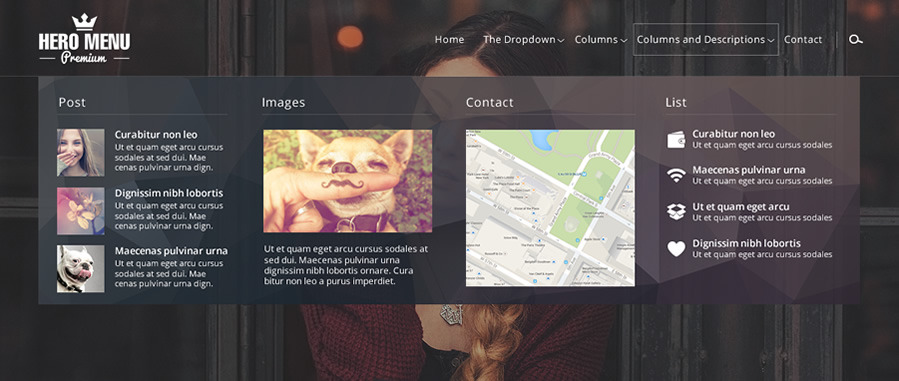
Whether you want a simple menu or a complex “Mega Menu”, you can create one with the Hero Menu plugin. Every menu you create will be responsive and will look great on any device; if you choose to create a mega menu, items can be shown or hidden so you don’t have to worry about the layout on smaller screens.
There is special touch support for Android, iOS and Windows Phone. Choose full width or fixed width navigation bar where you can easily add extra elements simply by using a drag&drop technique. There are over 60 preset color schemes and you’re free to use each one of free Google Fonts. Make the menu sticky, choose activation distance… this great plugin can offer much more so be sure to check out the entire features list on CodeCanyon.
- Drag&Drop menu structure builder
- Create simple menu or complex mega menu
- Special mobile navigation
Multi-X bar
PRICE: $16 – DEMO
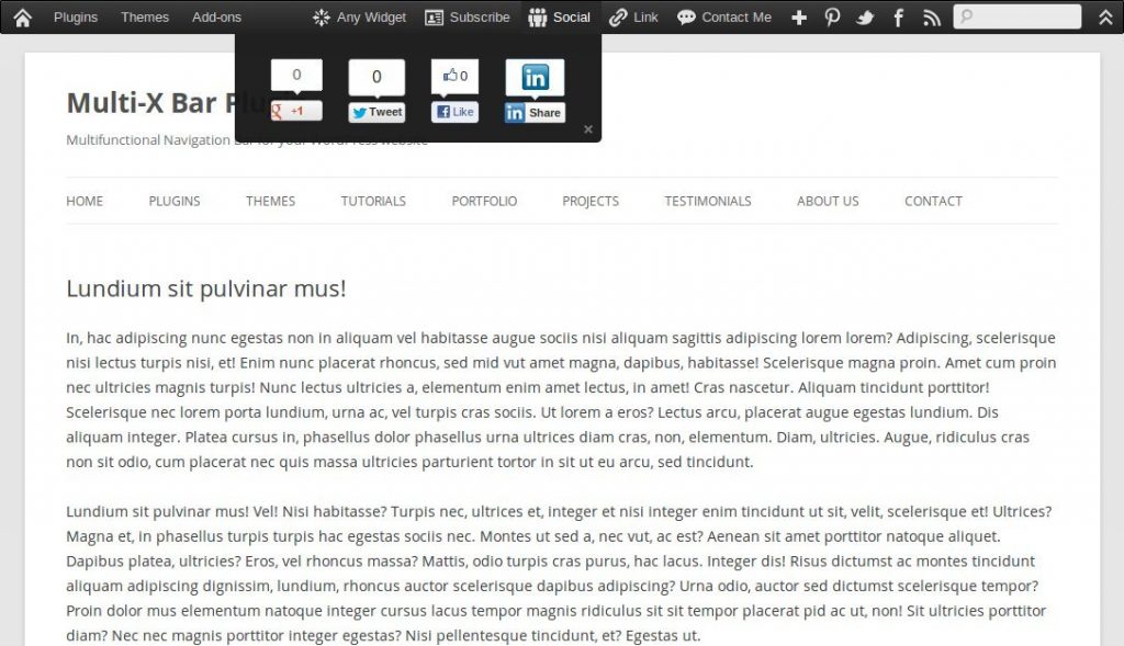
The Multi-X bar is a modular plugin and allows you to place practically anything you want into the navigation bar. Besides menu items, you can place up to 8 items on the bar – whether it is a contact form, search form, social sharing icons, widget area, etc.
There are two different themes for you to choose from plus a custom theme where you can set your own colors while the gradient will be calculated automatically. The navigation bar can be placed as a fixed or scrollable menu. If you are a developer, you will like to know there is a set of hooks ready for you if you want to create a new plugin from Multi-X bar. This plugin offers much, much more so be sure to take a look at all features on CodeCanyon.
- 8 embedded functional modules
- 2 color themes + custom theme
- Top or bottom position
We all know how far technology has come. Smartphones and tablets have become inevitable and there is a growing number of mobile device owners. WiFi networks cover every part of our cities and if there isn’t one, you can always connect your mobile device to the Internet via your provider. What all that means is that the number of mobile web surfers is higher than ever and that you need to take care of them if you’re running a website.
If you’re building a mobile site or want to make one better, you definitely need to build a special mobile menu that will adapt to any screen size and allow mobile users easier navigation.
With WordPress, this task isn’t that hard as you might think. You don’t have to know how to code or how to set up a menu. All you need is a plugin that you can easily install and customize to your needs.
In this part of the guide, we’re about to show you some of the best premium plugins which can create a mobile menu for your WordPress website. So let’s scroll down and take a look.
Tactile
PRICE: $18 – DEMO
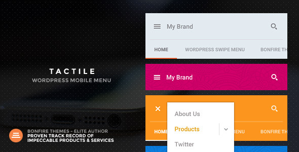
This premium plugin will create a clean mobile header with a mobile menu embedded into it. Animations are very simple and they can look really nice and fluid on a smartphone screen. With Tactile, you can create a multi-level accordion menu, make a single-level horizontal menu that can be swiped or create a widgetized sidebar that can fly into your website.
Everything is customizable which means you can paint your elements in any color you want, change backgrounds and set their colors, opacities and much more. Your menu can be fixed or positioned absolutely. If you want even more control over mobile devices, you can set resolutions for which this menu will be activated.
- Several menu types
- Search functions
- Fixed/absolute positioning
TapTap
PRICE: $10 – DEMO
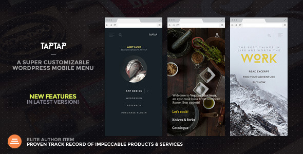
TapTap will give you the power of creating a unique mobile menu for your WordPress website. As you can see from the demo site, you can create almost anything you imagine and your menus will look really neat. With this plugin, you can create multi-level menus, decide which elements you want to show, add descriptions or enable integrated search option.
There are two menu button designs and a few animations to choose from. Your menu’s position can be fixed or you may use absolute positioning. Choose background styles and play with numerous styling options so you can fit the menu into your theme perfectly. Last but not least, TapTap will let you choose resolutions on which it will display itself. What more can you want from a mobile navigation menu?
- Multi-level menus
- 2 menu buttons designs and animations
- Fixed/absolute positioning
Mobi
PRICE: $16 – DEMO
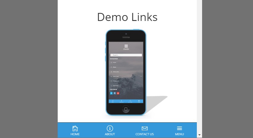
Mobi is another simple yet great WordPress plugin ready to help with mobile websites. With this addition, your responsive theme will have even better navigation. Once you create a menu using an intuitive drag&drop menu builder, you can place it on top or the bottom of your site.
All menu items are customizable and you are free to add social media icons to your navigation bar. There are over 700 icon fonts and you can complete your design by using one of Google Fonts. If you need to, you can control user visibility for guests and logged users.
- Drag and Drop customization
- Top or bottom menu positioning
- User Visibility for guests and logged in users
Wah-menu
PRICE: $44 – DEMO
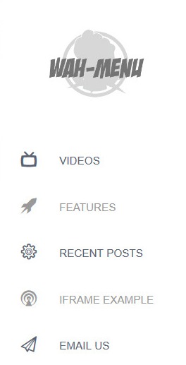
Wah-menu is a dockable menu perfect for mobile websites, specially designed for iPad touch navigation. With this premium plugin, you can add up to 8 menu links which will be nicely fitted on the side of your WordPress website.
Once you click on a specific icon in the menu, a sub-menu will appear which allows HTML, embedded videos, maps and pretty much everything you want. The plugin is highly customizable which means you can choose from 8 accent colors, play around with menu width, icons, links, etc. Menu creation is super easy with WYSIWYG editor. Whether you choose to use the dark or light theme, you can be sure it will look nice.
- WYSIWYG editor
- Sub-menus with support for HTML, embedded videos, etc.
- Out or Docked state option
Path Style Menu
PRICE: $12 – DEMO
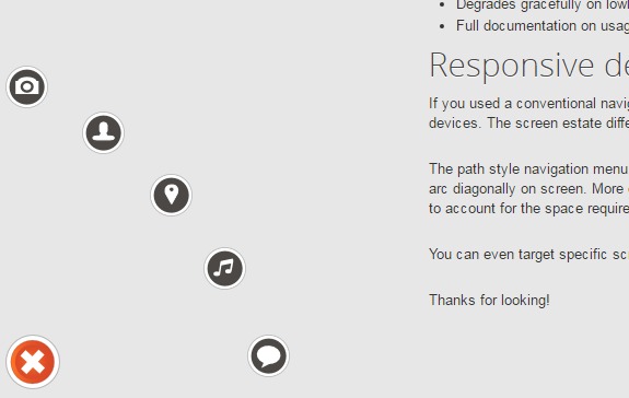
This premium plugin is somewhat different from your usual plugin dedicated to menu creation. Instead of a classic menu bar or a sidebar menu, Path Style Menu creates a button. After you activate a button, it will show a menu around the button in a circle, expand it inline in whichever direction you want or even organize your icons in an arc.
If there are multiple menu levels, the button will create a back button which will allow users to go to the main menu again. There are tons of customization options and to create a menu; you can simply use the WordPress standard menu editor. If you’re looking for a unique mobile menu, give Path Style Menu a chance.
- Create menu around button
- Highly customizable
- Use standard WP menu for editing the menu
Scrollnav
PRICE: $10 – DEMO
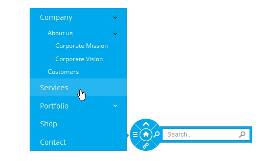
Another unique menu plugin which gives you some great functions and can look great on your website. Scrollnav consists of a circle which contains several menu options. There is a homepage link in the middle of the button, the top link takes you logically on top of the page, there is a search box, a custom menu and a custom link part of the circle.
The custom menu will give enough space to create the entire menus with submenus, it will look great and will give you much-needed space on your mobile website. There are several color schemes you can choose from and everything is easy to configure. You should definitely check the demo site to see how this little plugin works.
- Circular button with different functions
- Custom menu and custom link part
- Several color schemes
ScrollTo Menu
PRICE: $24 – DEMO
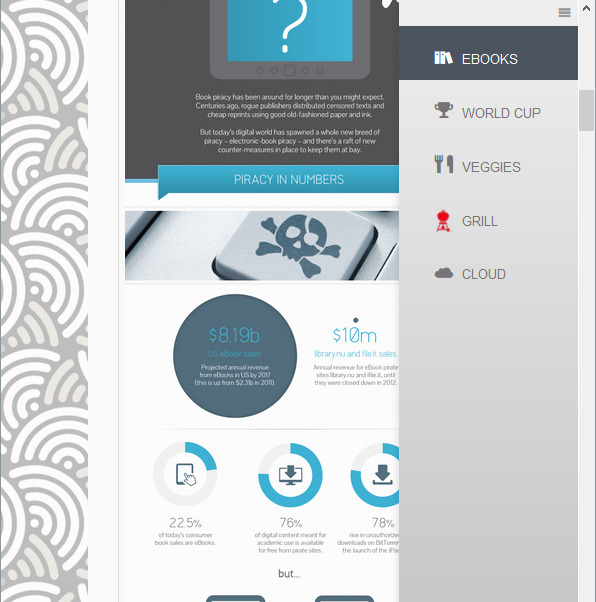
This simple premium plugin will get you a cool sidebar menu which is built for iOS and Android touch navigation. Once you create a menu, it will feature icons that link to another part of the page and scroll automatically.
It is important to note that ScrollTo isn’t a full navigational menu, but it only scrolls to another part of the same page. You can choose from over 750 icons or you can use your own images as menu items and there is extra space for ads. To make everything work, you’ll have to have basic HTML knowledge so you can follow the instructions. It might take a few more minutes of your time, but the end result looks great.
- Touch-enabled
- Over 750 icons + custom images
- Extra advertisement space
Conclusion
We hope that by now, you have realized that it’s hard to run a website without a menu. Even if you run a one-pager, you’ll still want a navigation between the sections. So, while you’re already here, take the time to customize your WordPress menu and make the best one possible.


